Home
Creating Mood With Color: Soft Palettes That Speak Volumes
When we think of color with impact, we often picture bold walls or bright accents—but some of the most powerful palettes whisper instead of shout. Soft, muted tones can shape a room’s mood just as deeply, creating calm, comfort, or quiet joy. These aren’t bland neutrals—they’re nuanced, emotive hues that shift with the light and speak with softness. Here’s how to use gentle palettes to design spaces that feel just right.
1. The Power of Subtlety
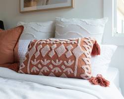
Soft colors don’t fade into the background—they invite you closer. Think dusty rose, warm greige, muted sage, and creamy oat. These shades don’t compete—they compose. When layered thoughtfully, they create atmosphere: restful bedrooms, serene living rooms, and kitchens that hum with calm energy.
They’re about emotion, not attention.
2. Choose Colors That Reflect How You Want to Feel
Color is emotional. A soft blue-grey can feel meditative and grounding. A warm blush can make a room feel nurturing and intimate. Pale olive adds earthiness. Washed terracotta brings quiet warmth. Ask yourself not just what colors you like, but how you want the room to hold you.
Your color choices should feel like an exhale.
3. Layer Tones for Depth, Not Flatness
Monochromatic doesn’t have to mean monotone. Layering various tones of the same hue—like stone, clay, and sand—adds depth without loud contrast. Use a mix of textures (linen, wood, ceramics) to break up the palette and give the eye subtle shifts to follow.
Soft doesn’t mean safe—it means nuanced.
4. Let Light Play a Role
Soft colors change beautifully with light, from morning glow to golden hour. Embrace that. Choose colors that shift gently throughout the day, and use lighting that enhances their warmth or coolness depending on the vibe you want.
In low natural light? Go for warmer soft tones like mushroom or dusty peach. In bright rooms, cooler greys and seafoam tones can add balance.
5. Use Contrasts for Calm, Not Drama
Soft doesn’t mean saccharine. Contrast your gentle palette with grounding elements—dark wood furniture, matte black fixtures, or clean white trims. This keeps the room from feeling too washed out while still preserving the overall softness.
It’s all about gentle tension, not hard edges.
6. Don’t Skip the Personality
Even the quietest palettes need something personal. Add in art, vintage finds, or organic forms that bring soul to the softness. Your room can be calm without being clinical—let the stillness hold a story.
Because soft color doesn’t mean a silent space—it just speaks in a lower, lovelier tone.
Summary
Quiet Colors, Loud Impact
Creating mood with soft color isn’t about being timid—it’s about being intentional. These shades don’t demand the spotlight—they create the setting. And sometimes, that’s where the magic lives: in the quiet confidence of a palette that makes a space feel like home.